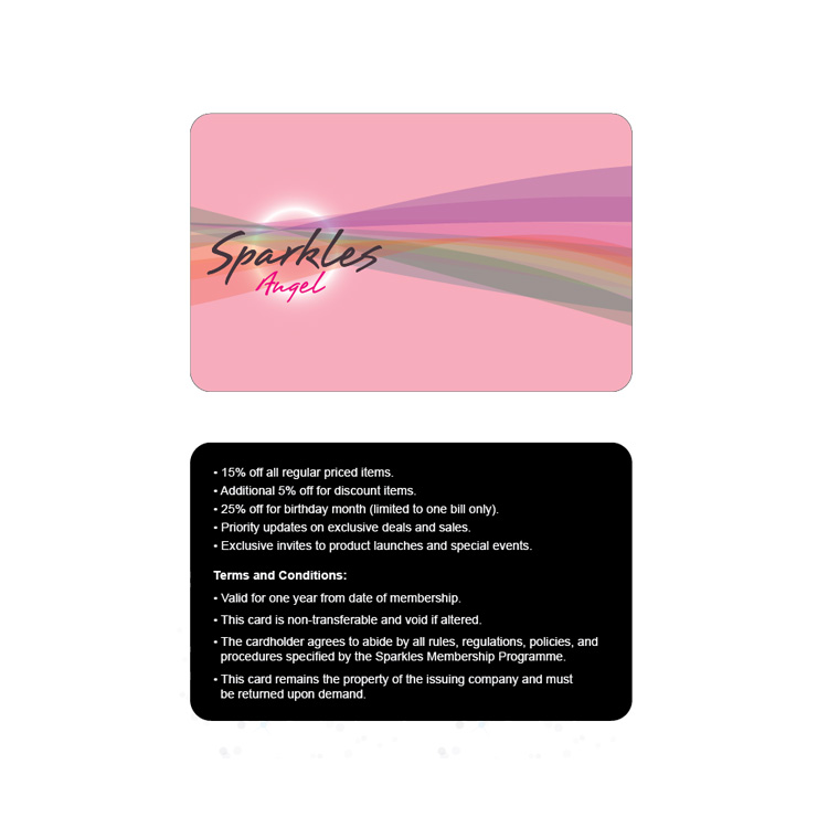
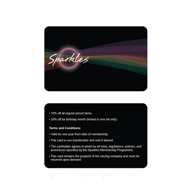
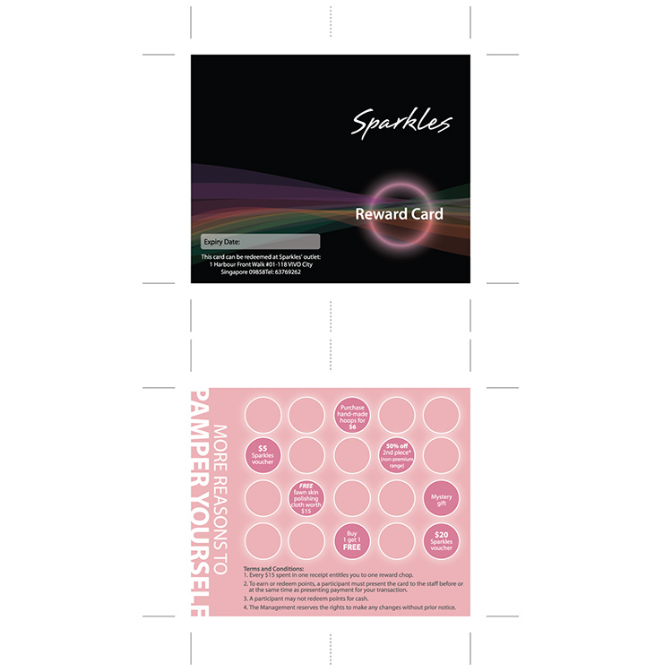
We wanted to use a font for its simplicity and style. A font with an edgy yet feminine stroke. The font, which the logo is based on, coalesced these traits.
For the membership and reward cards, the concept is to put the brand at the forefront of style, femininity and sass. This vision was materialised by creating aurora streams depicting these qualities. The light culminates to a halo forming the backdrop for the logo.


