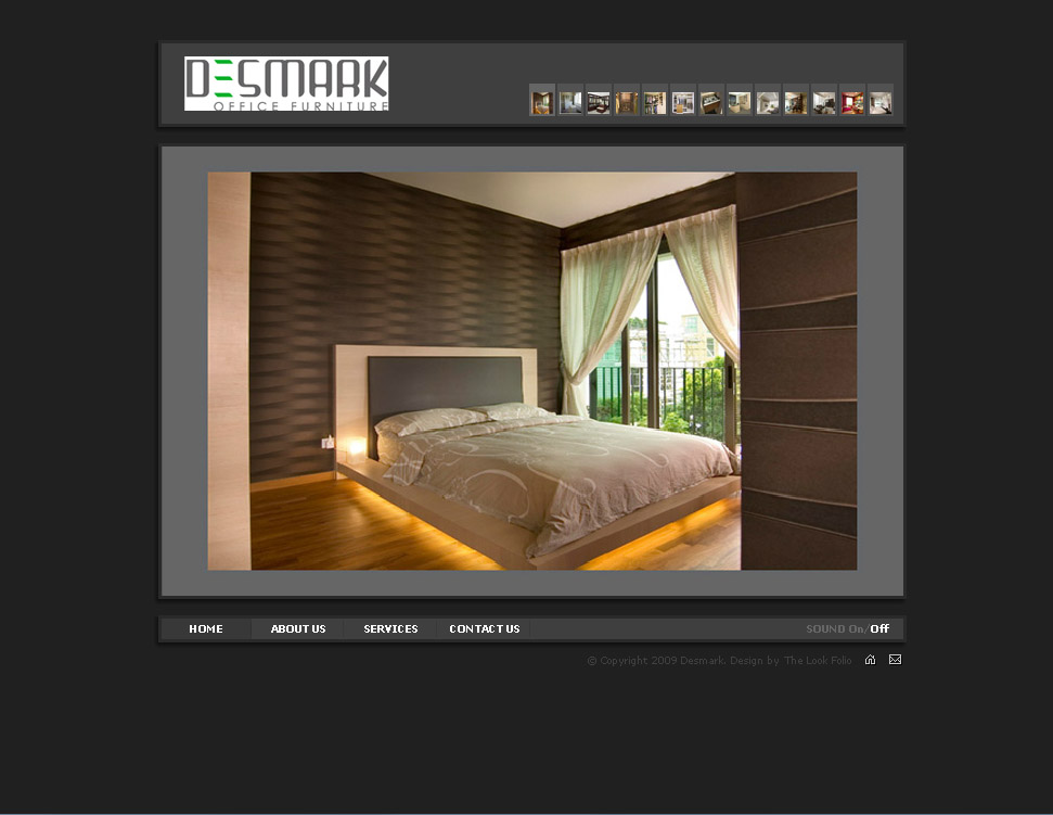
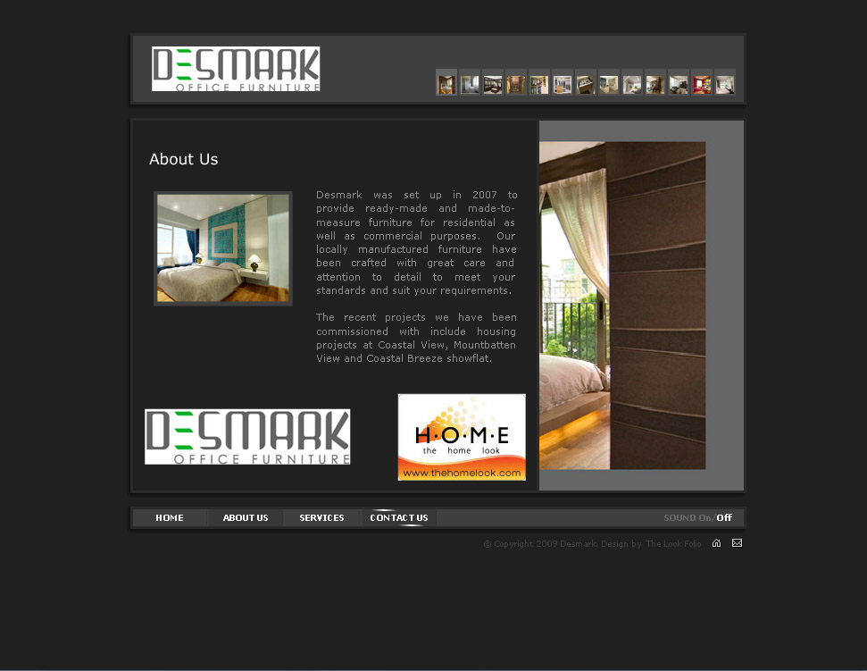
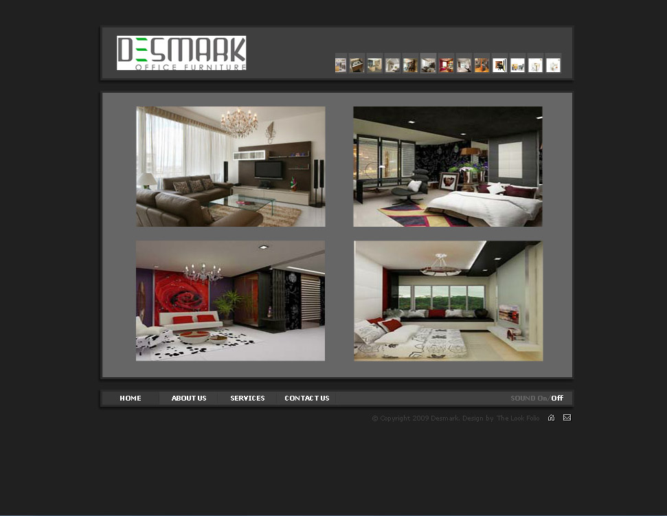
The idea behind the entire site is a camera frame. There is a photo-reel like picture-navigation on the top right that allows users to easily browse through products.
When users click on a picture, a “click” like that of a camera’s will sound. The selected product will then appear on the camera frame after a “flash”.
We advised the client to use a reverse-white logo — which we would happily create free-of-charge for them — but they chose to stick with this one. We hid our disappointment and did it according to their wishes.


